


|
#22
09-02-2006, 07:51 AM
|
||||
|
||||
|
What about this??? I ll stick with the blue instead of Purple
 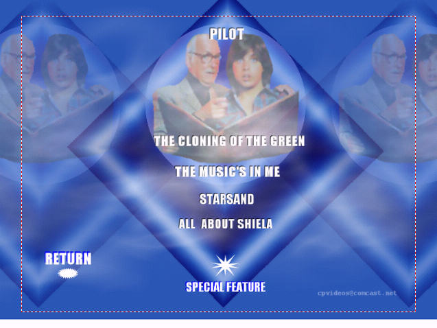 I started out with this one. It reminded me too much of webpage  Help??? I finished this set once. Just wanted to tweak it a little more 

|
|
#23
09-02-2006, 08:05 AM
|
||||
|
||||
|
Either one is fine by me. The blue is more graphically advanced. So go for that one.
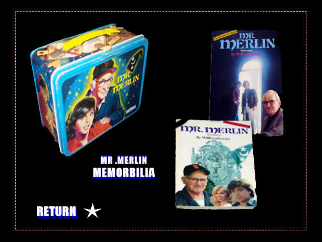
I think your project is looking fine so far. On that black-background menu, you may want to pull those image a bit more. That book on the upper right is riding really close to the overscan ledge, and I can bet parts of it will be chopped off on a tv set. What about this? 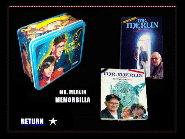 That shuffles everything to stay on screen visibly. A bit cozier and better-flowing on the eyes too, design-wise. And cp, use a dictionary. http://www.dictionary.com It's spelled MEMORABILIA. On that new blue menu, move PILOT down space equally with the rest of them. It looks stupid above the heads, put it over their bodies. And then fix that white strip on the bottom. Use a feather brush with a blue that is matched to the blue at the very edge before it turns white. 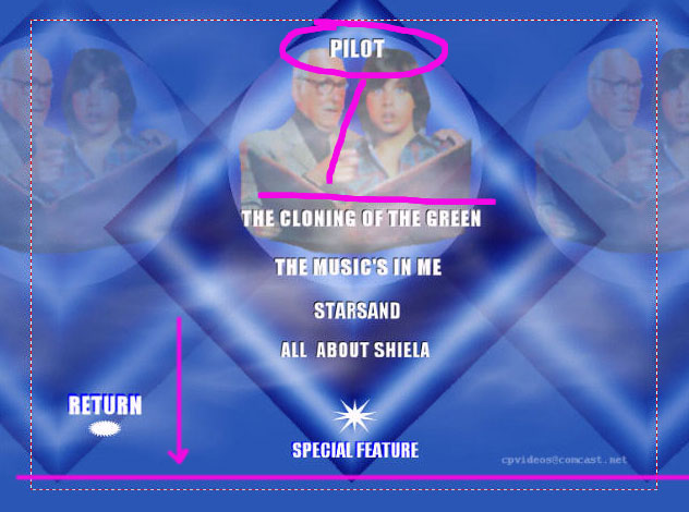
__________________
The LS Collection:. My Cartoon and TV Show List | My Want List | My Future Projects
|

|
#24
09-02-2006, 09:10 AM
|
||||
|
||||
|
LOL smart *** . I R nowing how to spell. LOL The old eyes and brain plays tricks on you at 5 am Gimme a break lol :P I cant see the white strip you're talking about? Must be this monitor? :P
|
|
#26
09-02-2006, 10:39 AM
|
||||
|
||||
|
Evenly space the text on the blue menu. Do not have some closer to others, or less space between some and more between others. Are you doing text in Ulead or Photoshop?
__________________
The LS Collection:. My Cartoon and TV Show List | My Want List | My Future Projects
|
|
#28
09-02-2006, 01:08 PM
|
||||
|
||||
|
Okay, then select all the text, then right click, and tell it to space evenly vertically. Be sure the top and bottom are where you want them, and the middle ones will fall in line. You can also tell it to align to the center, so everything is lined up correctly that way too. No more sloppy placements.
__________________
The LS Collection:. My Cartoon and TV Show List | My Want List | My Future Projects
|
|
#30
09-02-2006, 04:25 PM
|
||||
|
||||
|
I told you the blue would work CP
I know all, mwaaa ha ha ha ha
__________________
Not trading anymore, if you are interested we can work something out. Look ma I am sorta famous (and again).
|


|
#31
09-02-2006, 04:27 PM
|
||||
|
||||
|
Quote:
Plus we have to go one thing at a time. You confuse too easy.
__________________
The LS Collection:. My Cartoon and TV Show List | My Want List | My Future Projects
|
|
#34
09-06-2006, 11:17 AM
|
||||
|
||||
|
I would fade the 2 characters and change the saturation so they blend in with the parchmant.
That way you get the look like it was printed/embedded 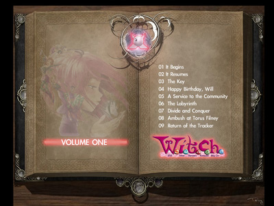
__________________
Not trading anymore, if you are interested we can work something out. Look ma I am sorta famous (and again).
|
|
#37
09-06-2006, 01:28 PM
|
||||
|
||||
|
See you got the fading idea. I would move the text over to the right page and maybe flip the font to something more fantasy looking
Also make the entire area behind the book black or enlarge the book to where the pages are just inside the tv safe zone and the binding/cover parts of the book are outside
__________________
Not trading anymore, if you are interested we can work something out. Look ma I am sorta famous (and again).
|
|
#38
09-06-2006, 02:33 PM
|
||||
|
||||
|
Evenly space the text vertically.
__________________
The LS Collection:. My Cartoon and TV Show List | My Want List | My Future Projects
|
|
#40
09-08-2006, 05:30 AM
|
||||
|
||||
|
No matter how I blended . It was way too bright
 I checked this as a desktop. I think it will be okay color wise. Just not as fancy as the other I found a differen't image. Curled the edges little blur & noise to give it an old look... I 'm stumped.... Picking a good clear fantasy font is a pain. They either look too fuzzy . Or not visible enough to read I chose Wolf's Bane Font on this one. Hoping it will be good on screen too.
|
 |
| Thread Tools | |


 Similar Threads
|
||||
| Thread | Thread Starter | Forum | Replies | Last Post |
| Re: Ulead DVDWS2 | lordsmurf | Record TV: Video Tech Support | 3 | 01-15-2010 04:11 PM |
| Ulead Workshop 2.0 | wheezer210 | Record TV: Video Tech Support | 9 | 01-13-2007 03:31 PM |
| Ulead Help? | cp32 | Record TV: Video Tech Support | 3 | 04-13-2006 03:20 AM |
| Ulead Dvd Workshop 2 help? | onlyemokid | Record TV: Video Tech Support | 12 | 07-11-2005 10:52 PM |
All times are GMT -6. The time now is 08:26 AM — vBulletin Copyright © Jelsoft Enterprises Ltd


