|
#1
07-15-2005, 06:59 AM
|
||||
|
||||
|
A tv set does not show 100% of an image, it's not supposed to, never was. Only about 93% of the inner portion of the image makes it onto the tv. That outer 7% is often filled with noise and may lack picture. And it is NOT the same on all sets, some are less, some are more, but it's always in a 5-10% area, no more than 2-3% margin of variation.
The computer allows you to see 100% of the image. This leads to problems.... DOWNLOAD FILE TROUBLES: You have "downloaders" which are stupid, because they crop the image when they encode and upload online. They SHOULD HAVE just covered it over with a black mask of a few pixels on each side (cover it, hide it). People that download these files usually continue being stupid, and do not restore the overscan. So the DVDs made from download files are missing about 5-10% of the image. That number may seem small, but it's very easily noticed, especially when the station ID logo is half cut off down the screen. It's as bad as watching the fullscreen version of a widescreen movie, where you can have action and whole characters cut out of scenes. See this guide here for information on how to re-encode downloads to MPEG-2 with proper methods, restoring the overscan: http://www.tvpreservation.com/forum/...peg-2-583.html DVD MENU TROUBLES: A lot of people sit at the computer and make what they think is a really nice menu, only to burn it, and part of images, buttons and words are totally cut off the screen. Oops. Sadly, some people are stubborn or lazy and never try to correct it. To illustrate how menu overscan works, I'm going to pick on myself and on markatisu, as we both made these mistakes at the very beginning of our DVD-making days. In 2001, I sat down with my $800 burner and my $9 each Pioneer blanks. I pounded out what I thought was a beautiful Robotech the Movie menu (and I still very much like it). It was supposed to look like this. That's what I saw on my PC screen. 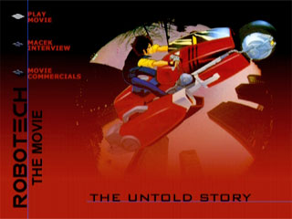 I burned my $9 blank, and to my horror, I saw this on the tv: 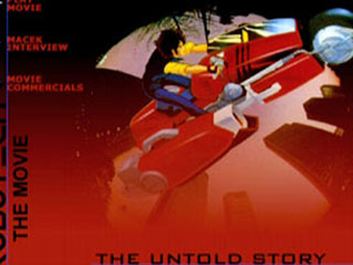 At the time, DVD-RW was still new and cost about $25 each, so I didn't own any. But I went and bought one, much to the chagrin of my checkbook, and experimented until I learned on my own how to fix this. You see, back in those days, stone ages of DVD tech, nobody had "guides" online, nor were there any books in stores. Anybody that started this in 2003 or later is really lucky, and should remember that, with the abundance of software/info and low prices of media that exist now. I created this template, a PSD file I've had for 4 years now, to be sure I never "messed up" again: 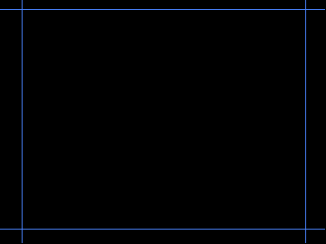 I re-did the menu, like so: 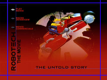 Note: for those of you not familiar with Photoshop, all the blue lines you see are guides in the software, they are not saved visibly onto the image, they can only be viewed in Photoshop (and when turned on). As you can see, the menu is correct. Nothing was cut off. Now it's time to pick on markatisu, and one of his first sets, the Aladdin DVD series. He made the opposite error, something that shoul have been partially off the screen was not, so it looked bad. Remember how I said earlier that "overscan can range from 5-10%, not all tv's match" ? Markatisu made this menu: 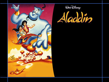 But this is what was seen on tv: 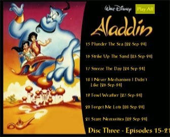 Not a pretty sight. The text on the right was cut off, and the image on the left showed the outer border, which should have been bled off screen. Bled? Bleeding is a printer's term, it describes printing something slightly larger than the paper, so you ensure that ink fully covers the entire piece of paper. Let's go ahead and look at this example from the printing point of view, using a standard 8½x11 piece of paper, and printing a photo from your printer. And let's say we're printing a picture that is to be framed and hung on the wall. Which looks better? The image that still shows the paper... (no bleed) 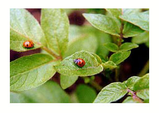 ... or the image that is just the image? (bleeding) 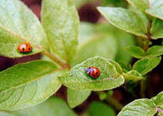 Now let's apply that to the DVD menus: In order to ensure you do NOT see the outer edges on any tv set, be sure you bleed the image. Be sure to pick an image, to where if you lose something from the bleed, it won't make a big deal. Refer back to my ROBOTECH THE MOVIE menu for a minute. A simple gradient pattern was bled, something that does not matter too much, not like icons or words or the bike picture. I went ahead and re-did the menus on markatisu's Aladdin set (did that yesterday and today, actually): 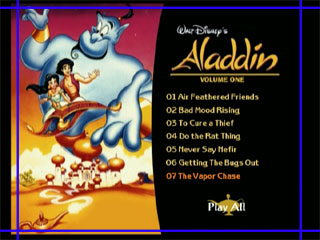 This is what is now seen on tv: 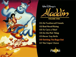 The "seeing the border" issue is now gone. As is the text spillover. The more you bleed, the safer you are. I'm probably cutting it awful close here on the Aladdin set, but it's still well beyond the boundaries on all the tv sets I have here, one of which is terrible about showing too much. I suggest bleeding as much as you can. CONCLUSION: This may seem like a long read with a lot of pictures, but this is what separates more professional-looking menus from the kinds of crap people like transformersCDs and other puke together with no effort, thought or skill. These are the skills. Use them.. You can download the PSD OVERSCAN file attached at this bottom of this post. Also, all menus are designed 4:3, meaning 720x540 pixels. Your DVD software should take them just fine, and in fact, most requires 720x540 or at very least suggest them. Designing at 720x576 or 720x480 is no good, because it's not 4:3 and will stretch out differently than how it was designed. .
__________________
The LS Collection:. My Cartoon and TV Show List | My Want List | My Future Projects |
|
#2
07-15-2005, 07:15 AM
|
||||
|
||||
|
Hey, I just spend 30+ minutes writing this thing. I hope somebody appreciates it, and can learn from it!
__________________
The LS Collection:. My Cartoon and TV Show List | My Want List | My Future Projects |
|
#3
07-15-2005, 07:35 AM
|
||||
|
||||
|
Wow, this explains to me what overscan is...but...:-\ when I capture my shows, it goes directly to MPEG and I just edit out the commercials...alright, but should I add the black lines you say?
|
|
#4
07-15-2005, 07:41 AM
|
||||
|
||||
|
I would not worry about that. You capture from tv to watch on tv again. You'll never see the video noise outside of your computer while editing, maybe previewing the author.
Though it does suck up a bit of bitrate when re-encoding, so always be sure to mask if you re-encode files. AOA, as far as you go, just remember this info for your menus. Don't wrry about your episode captures on your Hauppauge capture card, they're fine in this regard. Same goes for anybody else that captures direct to MPEG, using either a capture card or DVD recorder. The only exception may ATI MMC users, as it has a crop feature that masks the overscan when enabled, gives a better bitrate allocation to the video. That helps because it's hardware/software hybrid.
__________________
The LS Collection:. My Cartoon and TV Show List | My Want List | My Future Projects |
|
#5
07-15-2005, 07:47 AM
|
||||
|
||||
|
I love graphics lessons. Even though I'm not doing DVDs with image menus, I like to read about how things should be done - there are some shows I've collected from various sources that I would like to re-author at some point, so this is very useful. And there are a few things I've downloaded that I'd eventually like to put on disc for my own amusement.
LS, have you looked into work as a technical writer and/or trainer? You structure information well - if you haven't considered those options, I'd recommend it.
__________________
Update 7Feb12 - Still not really trading, except for a few selected sets for friends. Check out my fannish activities through my home page at http://www.debwalsh.com/. Thanks for your understanding! E-mail only - no PMs, please. |
|
#6
07-15-2005, 07:59 AM
|
||||
|
||||
|
Thanks deb, I'd actually not given much thought in that direction, but I may look into more since I'm actively seeking a new career.
__________________
The LS Collection:. My Cartoon and TV Show List | My Want List | My Future Projects |
|
#7
07-15-2005, 02:32 PM
|
||||
|
||||
|
Good dose of learnin' for today. Excellent as always.
LS and digitalfaq.com is why I'm as good at what I do today.
__________________
.:| My Website .:|:. My Comics .:|:. My Photos .:|:. My ebay Auctions |:. http://feeds.feedburner.com/Superheroes-r-us.5.gif http://feeds.feedburner.com/allaboutduncan.2.gif |
|
#8
07-15-2005, 10:30 PM
|
||||
|
||||
|
Hey dont pick on my baby ha ha ha lol, at least I got most of the episodes in the safe area, thats a plus
Also make sure you use the template as a GUIDE and the borders just as LS said, he sent me that guide and thats what I used on Aladdin which is why MOST of it fit on the TV but I did not realize you had to bleed, so obviously you see what happened above. Without the guide though it probably would have looked more like Robotech the Movie especially given the amount of stuff that was on the screen Just to how I learned from my error and used the guide properly this is what is seen on the screen from the Jackie Chan Menu and both tuck and bleed methods have been used as the text and the side items are safely tucked in and the banner is bled out, that way it looks as if the image goes from left to right on any TV and does not stop short as Aladdin did for example with the Genie pic. Note that the black part above the JCA banner is meant to be there, much like LS Stargate it is part of the design, it was meant to be a banner. Without using the guide and experiencing what I did on Aladdin for example the banner probably would show black sides or be uneven in length and just look really bad 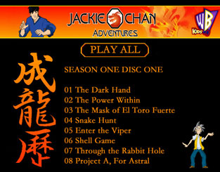
__________________
Not trading anymore, if you are interested we can work something out. Look ma I am sorta famous (and again). |
|
#9
07-15-2005, 11:10 PM
|
||||
|
||||
|
One the reasons I like TDA, you can enable a "TV Safe" grid area, which will show where the overscan may impact your menu. I leave the grid on when I author, since I've previously built some menus that were cut off.
By the way, LS, for Photoshop (which is my fav. program), what measurements did you use for the blue guide? The typical NTSC menus size is 720x480, just wanted to figure out where you set your boarders for the frame. |
|
#10
07-16-2005, 04:15 AM
|
||||
|
||||
|
Still objects: NTSC still image menus are designed 720x540 (4:3) and imported that way into authoring software. The authoring software will convert it to 720x480 on its own. You need not help.
Motion objects: Video also needs to be edited 4:3 in the NLE (it should do that automatically). You need to encode the file out to 720x480 and import it that way into the authoring software. "NLE" is a non-linear editor, like Premiere, Vegas, FCP, etc., and is what you'd likely make motion menus in anyway. This is more advanced: When combining stills/motion in the NLE, you may need to design the layers in Photoshop as 720x540. When done, merge the layers in the single alpha matte you'll need in Premiere. Shrink the image to 720x480. Import that with the video into Premiere. This needs to be done because the NLE actually has a pretty poor resize filter on matte images, so feed it something that's size-ready. It will preview 4:3 and that's all you need. Edit and save video as 720x480. The "tv safe" areas found in authoring software is generally poorly done. You should notice it tends to put the overscan at even pixels sizes, but the overscan is half the height on top/bottom as it is on left/right. That alone can be a problem, which is why I use Photoshop for more precise design. The way you drag guides out on Photoshop is by showing the ruler, under VIEW, and then clicking in the ruler and dragging out a guide. You may need to also enable showing the guides, under VIEW. Better yet, download the PSD I have in the instructions post at the top.
__________________
The LS Collection:. My Cartoon and TV Show List | My Want List | My Future Projects |
|
#11
10-29-2009, 07:42 PM
|
||||
|
||||
|
where can i download this overscan again?
|
|
#12
10-30-2009, 04:22 AM
|
||||
|
||||
|
The original post has been repaired. PSD attached to the post.
__________________
The LS Collection:. My Cartoon and TV Show List | My Want List | My Future Projects |
 |
 Similar Threads
|
||||
| Thread | Thread Starter | Forum | Replies | Last Post |
| DVD Copy Issue | bigk181 | Record TV: Video Tech Support | 10 | 06-08-2009 11:49 PM |
| Can someone make a Widescreen PSD Overscan? | konfusion | Record TV: Video Tech Support | 4 | 02-18-2008 01:11 AM |
| DVd creating issue | SavageAmusement | Record TV: Video Tech Support | 10 | 05-03-2006 05:21 AM |
| Dvd+r Burning issue | staypuftman2004 | Record TV: Video Tech Support | 3 | 07-23-2005 04:35 PM |
All times are GMT -6. The time now is 05:13 AM — vBulletin Copyright © Jelsoft Enterprises Ltd


